Technical analysis is the main tool that investors use to work out where cryptocurrency prices are heading next.
In conjunction with sound fundamental analysis, it can help to plan trades, mitigate risk and improve your bottom line. Depending on the market sector and conditions, there are signals and metrics that work best.
This article explores 4 popular technical indicators to analyse a cryptocurrency.
Simple Moving Averages
In a market as volatile as cryptocurrencies, it is important to have a graphical representation of the wider picture. Sometimes, a typical candlestick chart is not enough to provide an overview of price action. This is where moving averages come into play. There are several types, but the most common is the Simple Moving Average or SMA (Simple Mean Average).
These averages are calculated by adding up the closing prices in a timeframe and dividing this by the number of time periods. Thus, a curve is formed that —in very general terms— gives us an idea of the upcoming trend. If the curve moves upward, the price could follow an upward trend, and vice-versa. The most popular time periods used are the 50, 100 and 200-day moving averages (SMA50, SMA100 and SMA200). These give us an idea of the price action in the short, medium and long term.
Before being adding to a graph, the data is configured into daily periods. It is important to note that long-term moving averages, e.g. SMA200, will only work for cryptocurrencies which have data going back at least one year ago – so brand-new cryptocurrencies cannot be analysed in this way.
Thus, the moving average works better for currencies like Bitcoin or Ethereum that have established price trends.

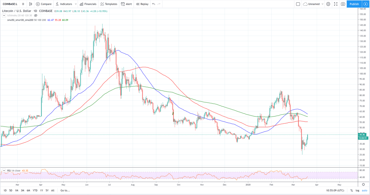
To have perspectives at different timeframes, several moving averages are usually looked at simultaneously. It is important to identify and understand these before adding them to a graph. In this example, the moving averages for the price of Litecoin vs. USD have all been added to the chart: blue curve (SMA50), red curve (SMA100), green curve (SMA200).
Crosses in Moving Averages
One of the benefits of adding all three moving averages into a single graph is that we can detect crossovers.
Crosses are one of the best kept secrets of professional traders and, in many cases, can be very effective. They indicate a breakout in a trend and are considered a strong bullish – or bearish – signal.
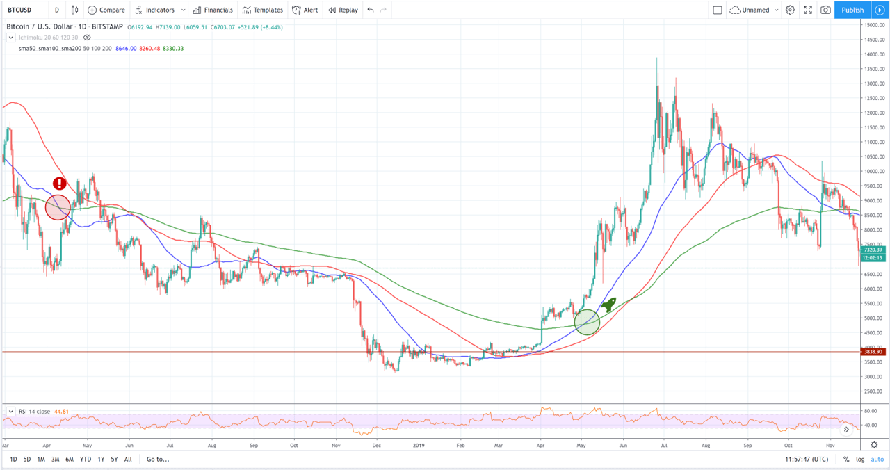
The most effective crossings are those that occur between SMA50 and SMA200:
- Death Crossover: Occurs when SMA50 is above SMA200 and crosses below. It is a bearish signal that usually indicates that a period with selling pressure is coming soon.
- Golden Crossover: The bullish sign traders look out for. Here the SMA50 crosses the SMA200 to the upside, indicating buyers will enter the market and raise the price.
The candle chart for the price of bitcoin above shows a golden cross and a death cross on one chart. Furthermore, it demonstrates how useful these indicators are for detecting early trend changes in medium term price-action.
RSI or relative strength index
One of most important and powerful indicators for analysing financial assets. The prestigious firm Fidelity defines it as follows:
“The relative strength index is a momentum oscillator that measures speed and changes in price movements.”
RSI is a percentage metric that ranges from 0 to 100. In addition to giving us an idea of trends, the most common use of RSI is to determine when an asset is possibly overbought or oversold.
Traditionally, when the RSI exceeds the 70% barrier, the instrument is said to be overbought – meaning a sell-off may be imminent.
In other words, buyers have been too aggressive opening long positions, and the purchasing power begins to become exhausted indicating a technical correction to the downside, something traders can take advantage of in opening trading positions.
When the RSI falls below 30%, the instrument is said to be oversold. This could indicate a possible upward bounce in the form of a technical correction or reversal. However, these are approximate levels and some analysts prefer to move them further towards the extremes (80% and 20%, for example). In very strong trends, the RSI can stay longer in oversold or overbought areas.
Depending on the timeframe of the candles on the chart, the RSI can indicate short- or long-term conditions. In general, it is usually used for candles of more than 4H.
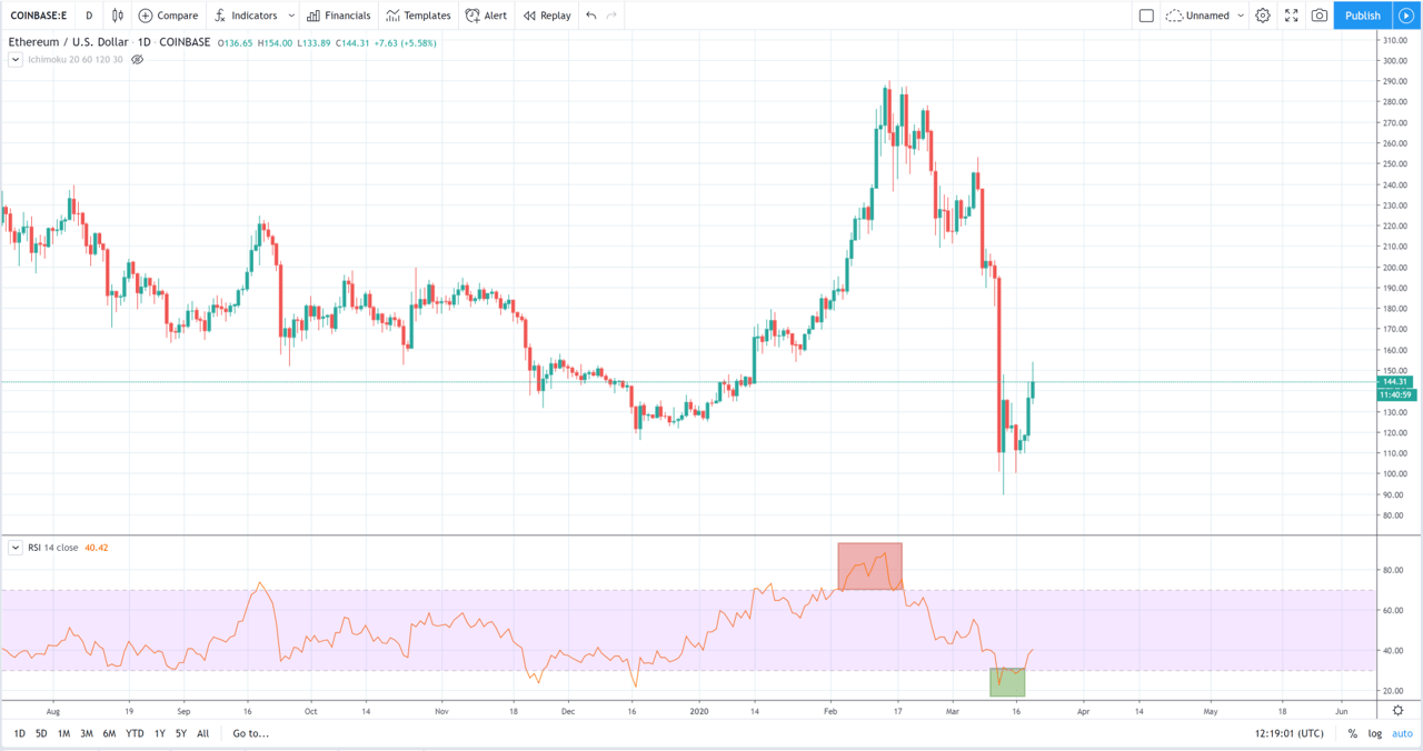
RSI is very easy to detect and analyse. In this daily Ethereum chart, it is clearly seen that the RSI falls in the overbought zone and then in the oversold zone, with quite consistent price reactions.
Volume and order books
Buy and sell volume can help us identify bearish or bullish price-action. These depend on the chosen platform and are better technical indicators of cryptocurrencies when they come from an exchange with high liquidity.
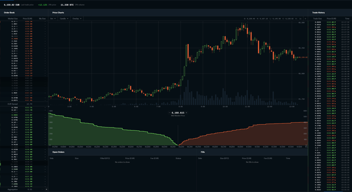
The order books give us real-time information on where the bulk of limited buy and sell orders are located. This can give a general idea about buy and sell “walls”, which can act as another form of support and resistance for prices are likely headed next.
However, data such as this should not be taken at face value, particularly in such fast moving and volatile markets.
Coinbase Pro displays a live order book, with a depth chart. Here you can search for unusual increases in volume at a specific price, indicating intention to buy or sell from institutional investors.
Other indicators of interest
In our article “How to detect when a cryptocurrency is about to explode” you will find other fundamental indicators that can complement your evaluation and improve your results.
Where can you analyse these charts?
The platform par excellence for technical analysis is TradingView. However, many exchanges and brokers provide their own tools for evaluating indicators, such as volume or the order book. The following table shows some of the most popular:


